
TE KURA O OAKURA
OAKURA SCHOOL
MĀTOU / US
[ OUR JOURNEY ]Te Kura O Oakura / Oakura Schools mātou represents the kura (school), the hapori (community) and the whenua (land)
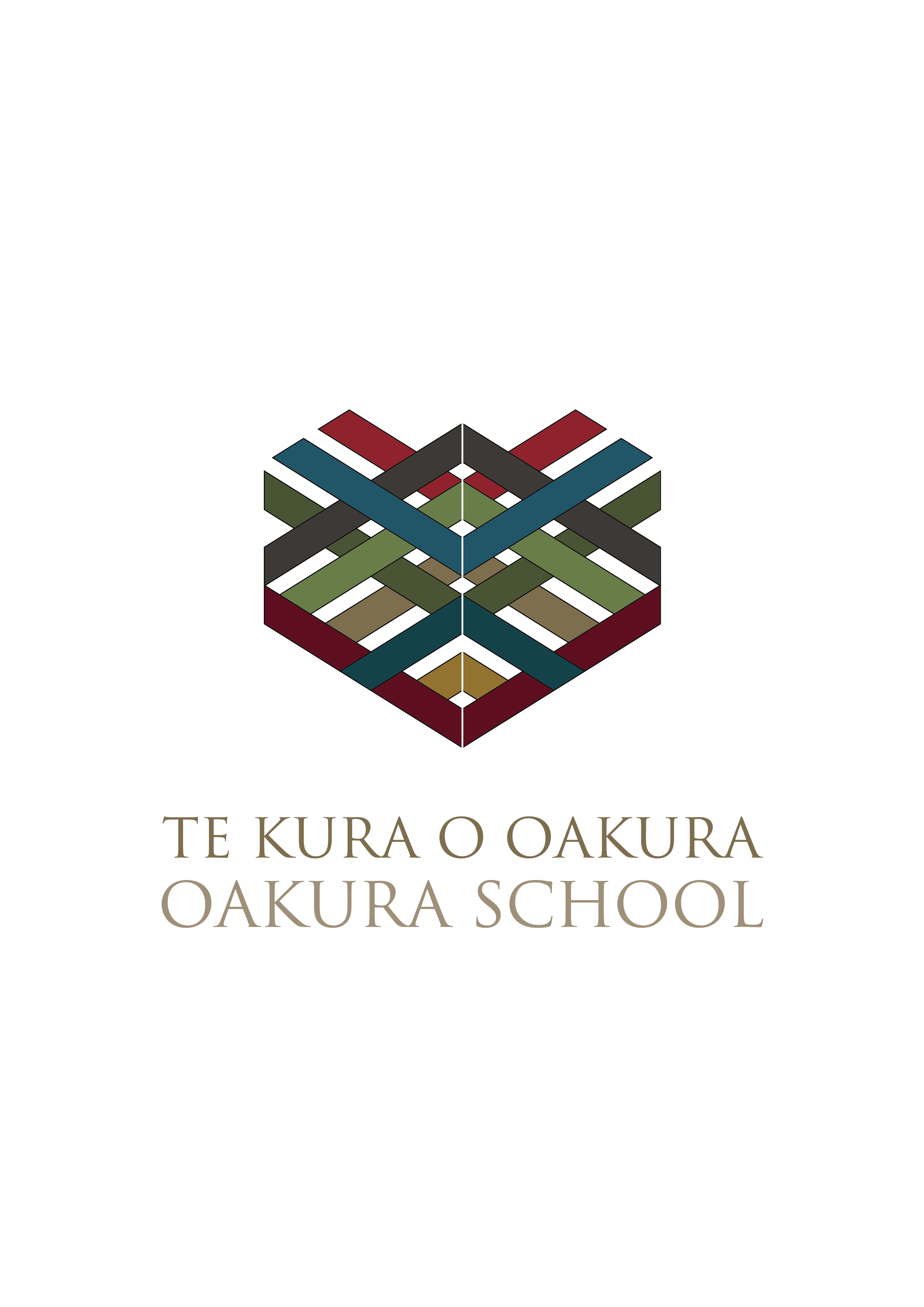
We use the word ‘mātou’ instead of brand or logo, because ‘mātou’ translates as ‘us’... which is more than just a symbol or brandmark. Mātou connects and represents the people and the stories on a deeper level. It symbolises how the school presents itself to others. ‘This is us’... this is what we do, believe, represent, these are our values.
Te Aranga Design Principles are a cultural strategy/approach to design thinking and making, which incorporates a series of Māori cultural values and principles. These include; Mana, Whakapapa,Taiao, Mauri Tu, Mahi toi, Tohu and Ahi Kā.
To be faithful to these principles, we have considered the past, the present, and the future, in this design.
This journey recognises the value of the current design and the connection with people... past and present. We reflect on this connection as we begin our journey into the future
The new mātou, seeks a deeper connection. Taranaki Maunga still has pride of place, we have nowintegrated expressions from the kura houses. We unite them together as woven strands, each telling their own stories, interconnecting and collaborating.
We believe these strands reflect the Te Aranga principles, not just visually, but with the stories they tell and the people that will hear them.
[ OUR STORIES ]The house colours, Wairau, Patuhā, Koru and Matekai - are derived from the names and the stories of important local sites in Oakura. These stories were shared to the kura, by Ngāti Tairi - mana whenua of Oakura. It is these stories we use to inspire the mātou.
-
Wairau is the name of a stream that runs through Oakura. Wai means water and rau means leaves.
Many local streams originate from springs in the surrounding areas and connect together.
-
Patuhā is the name of one of the first chiefs who arrived in Taranaki. He named the highest peak in the Kaitake Ranges after himself. He is known as the kaitiaki (guardian) of the peak and his mana remains on this peak.
-
Te Koru is the name of a high ranking chieftainess who constructed and put her name onto Te Koru Pā, where her people and descendants lived.
Koru Pā is one of the best preserved Pā in Aotearoa.
-
Matekai Park, a recently created reserve sits in the middle of Oakura. The stream that runs through our school’s Envirocentre is the Matekai Stream.
Matekai means to be hungry.
Matekai Park also provides food and protection for the endangered Moko Mangaeka / Goldstripe gecko.
The mātou intends to express the stories in a simple and symbolic way, and give a sense of belonging and understanding. It is important to keep these stories alive and represent them with pride of place.
The design is made up of multiple threads, that weave together to tell the stories, these stories all connect with Taranaki Maunga. Within the weaving we also can see the school values, woven into the patterns. The repetitive patterns within the design symbolise whakapapa, stories, histories and traditions passed down over time.
The design speaks to the shape of a school crest, and the shape of a heart - manawa. We may also see the shape of a wheku (ancestor, heritage, spirit).
A crest can be described as the top or highest part of something, in this case the crest of Taranaki Maunga. A crest can also mean a symbol of whānau and mana.
The crest is a vessel for the stories, it brings us together, and gives us a sense of place, respect, belonging and understanding to hold in our heart.
This design is the work of a collaboration between Ngāti Tairi, Oakura School and Hall of Design.
Without the input and the support of the Hapū, the depth and authenticity of the mātou, would not have been so clearly translated and the stories could not be confidently expressed. The mātou carries these stories with pride.
[ OUR MATOU ]Ka ora te wai, Ka ora te whenua,
Ka ora te tangata –
If the water is healthy, the land
is nourished, and the people
are provided for.